I’m noticing an interesting branding trend among software companies: a shift towards something more nostalgic and warm. It started with serif fonts and warm colors but AI-generated images is making it a bit broader.
Amp Code is going for a sort of neo-romantic mythical feel. Retool is inspired by 90s anime backgrounds. Radiant has retro computers in cozy offices with nature views.
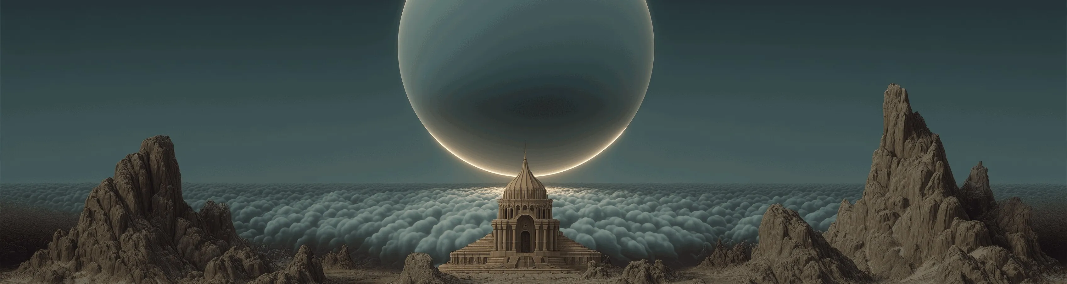
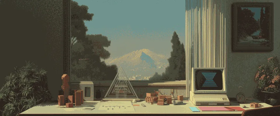
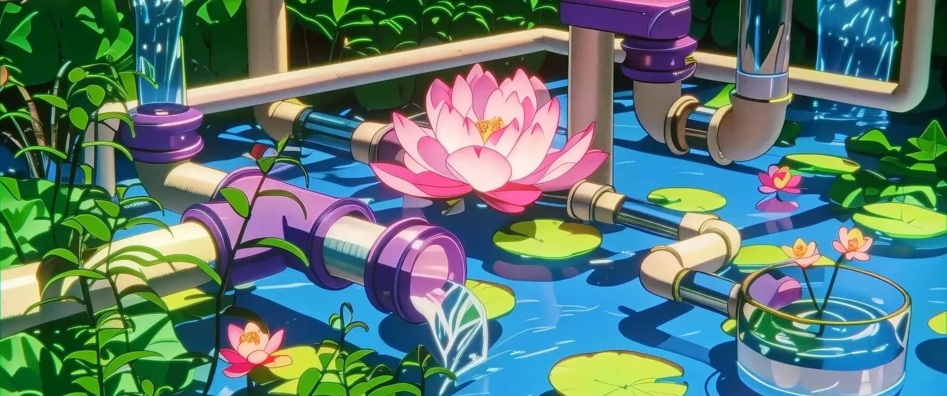
All of them signal something human, calm, contemplative — seemingly trying to stand out from the mass-produced / boring / sloppy feeling of AI-generated average-looking websites. Reminds me of Beyond The Black Rainbow, Project Cybersyn, and Soviet-era space posters.